
Card Guard Gallery Case Study:
Role: UX designer, UI designer
Team: Richard Erdursun, Raji and his Coding team Delhi
Tools: Figma, Photoshop, Illustrator, Premiere, Usertesting.com, Miro, Google analytics, Slack, WordPress, Divi, Google Drive, Google Meet, Zoom
Project Overview:
Client is a renowned International Poker player often playing high stakes in Las Vegas. He has the largest collection of Card Guards in the world from his many years of playing. His previous webmaster had stopped being compliant and had not updated the site in many many years. I was approached to compile his large vast database in a way that could be easily filterable and optimised to be seen internationally in the Poker community. 2180 plus Card Guards with assigned various information. The client had requested if he could become the soul operator of the site and that he as a very much novice computer user would still be able to use. There was to be a complete design overhaul and rethink in approach to viewing the cards and data management.
Exploring The Issues:
Previous webmaster was holding the host hostage to client. Website was made over 13 years ago in Windows and would need to be converted into Linux before being turned into a WordPress site. Database error issues, The MySQL database was so old when the extraction process began their was multiple aligning issues with details relevant to the correct cards and linking both front to back in a constructive structure. Client was restrictive on design liberties even with justification. Though with perseverance we were able to change his mind on many elements.
Project Scope:
In order to formulate a proper strategy research of any other Card Guard collectors or sites had to be done. Upon this it was realised he was the only fully dedicated site. Looking at the pre existing site the mobile app and website needed to be updated nearly in every way. A low fidelity hand drawn illustration was put forward and from that we worked in agile way with the client. We iterated based on our internal and external feedback from the technical and designer side as well as utilizing user testing to understand our audience better. This project was highly focused on the niche UX side as this site was more of a internal international casino collector target audience than you average gambler. The UI design was equally heavy exploring multiple solutions for launching this in a way that functioned correctly taking into consideration the various technical hurdles.
Design Process:
The nature of the way the filter would work would mean we would be in constant liaison with a team of back end developers in Delhi. They were very good at helping with the extraction from the database and some of the custom code required but due to the language, and distance barriers it was required to stay on top of them, often multiple times in a day. The high fidelity had got approval from the client the old site was mirrored for constant back up and comparison. Constant back and forth was required all the way through to delivery in a exceedingly fluid and agile way.
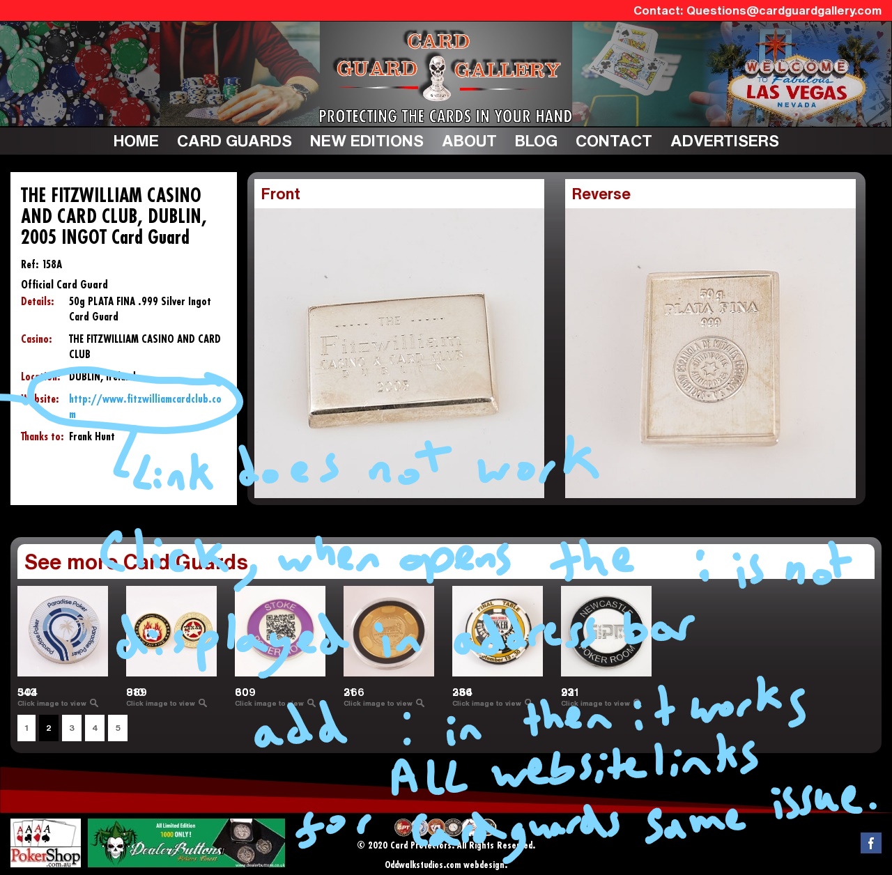
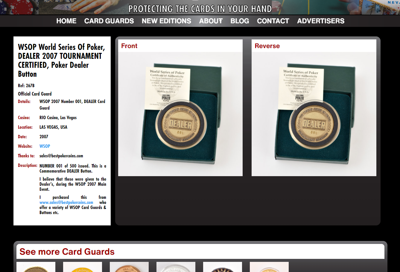
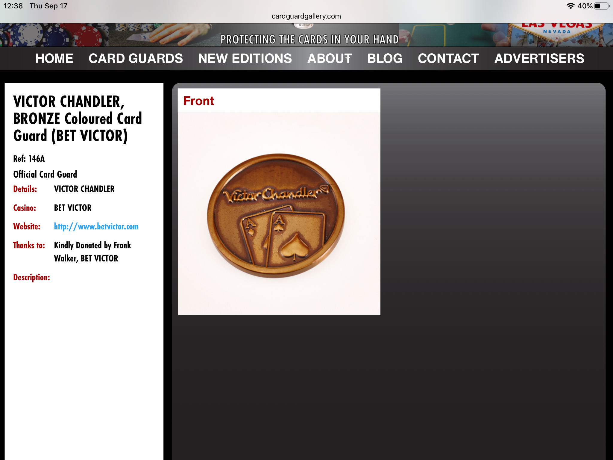
Snapshot Of Realised Issues In Internal Testing:
Testing:
After our low and high fidelity proofs and internal testing it was agreed that utilizing www.usertesting.com was the best course of action to see if there was anything we had missed
Participate in a challenge
Identify the purpose of the site
Find a certain Card Guards
Along the way, they were asked about their thoughts. At the end of this task, we asked them to rate the following statement on a scale of 1-5, with 5 being the most favorable: “I understood the purpose of challenges.”3 out of 5 strongly agreed (5/5 rating) 2 out of 5 moderately agreed (4/5 rating)
Wireframe:
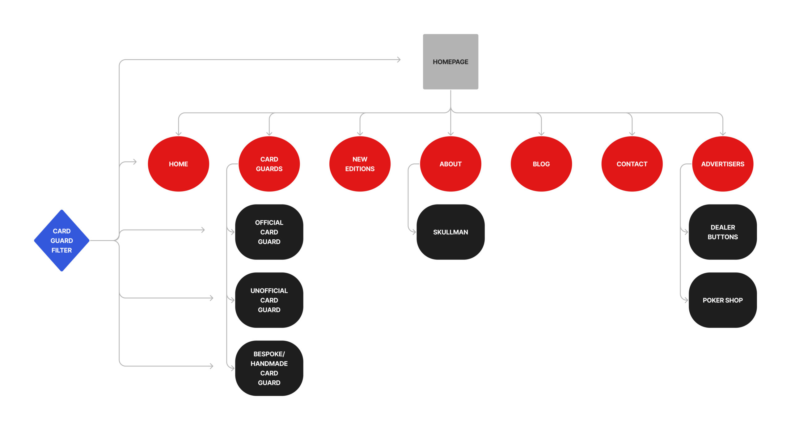
Site Map:
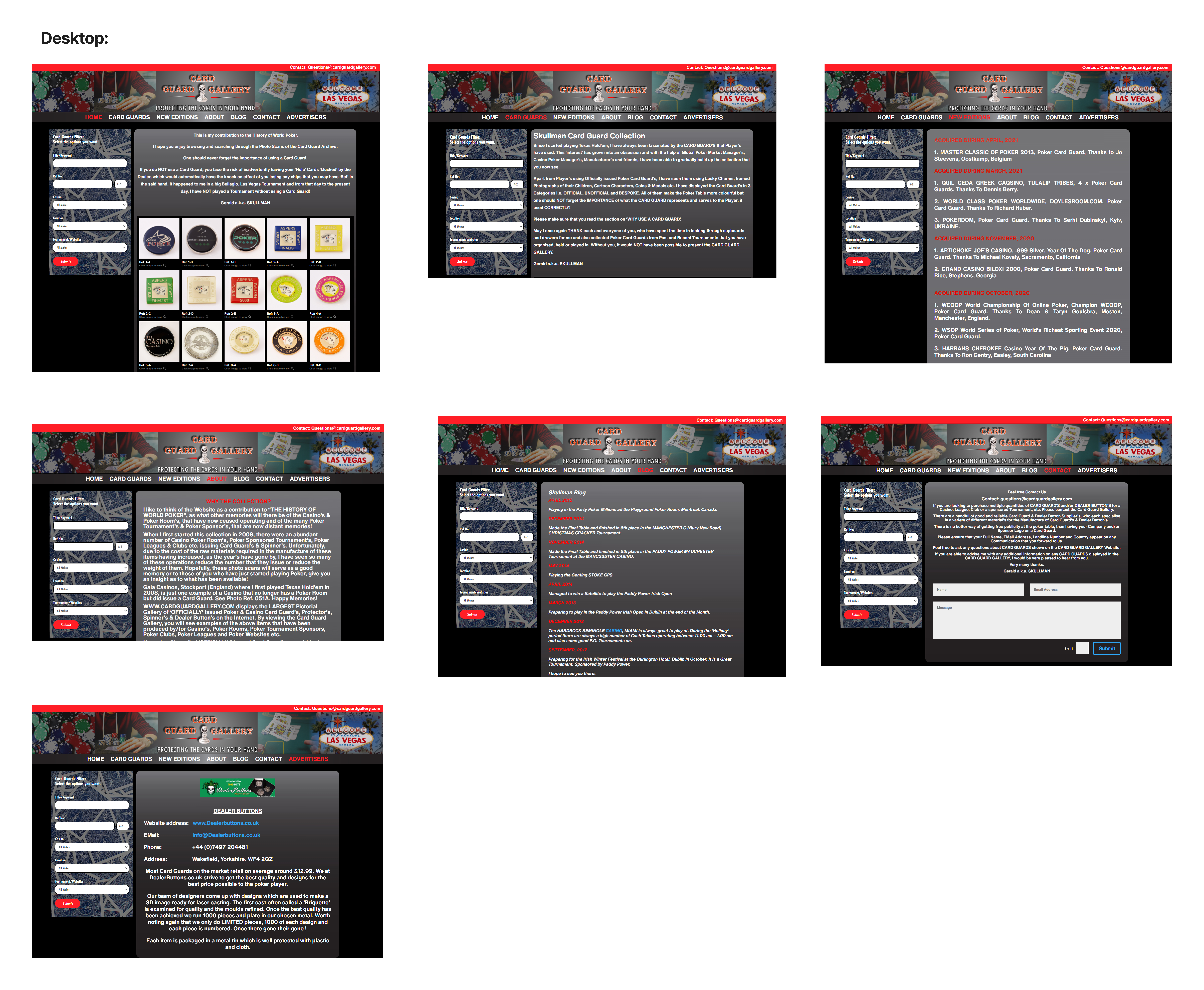
Mobile/ Device Reactive Responsive Design:
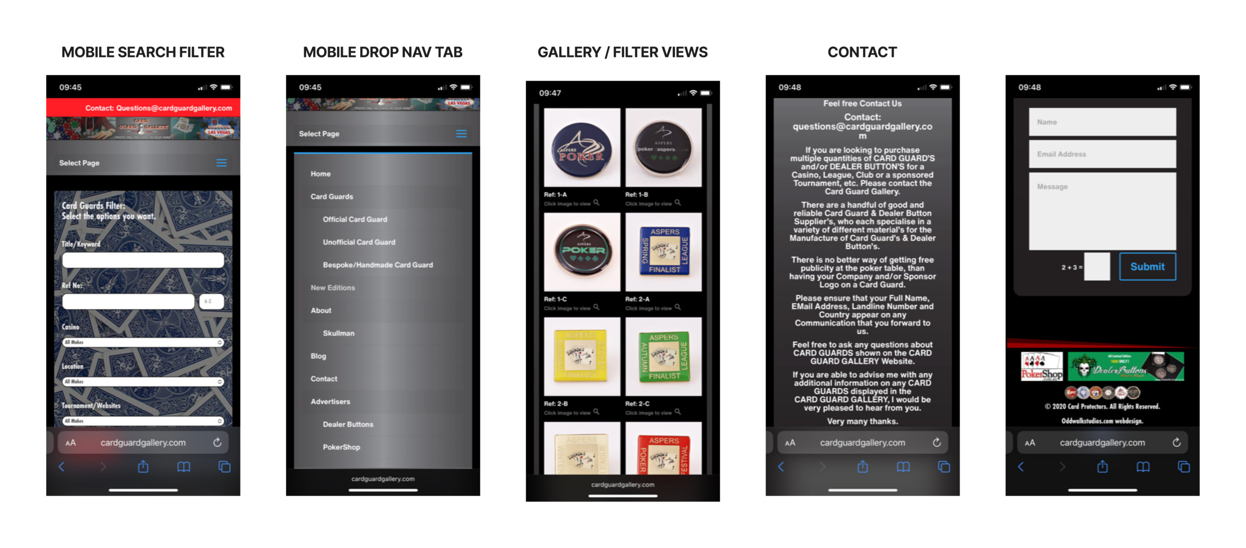
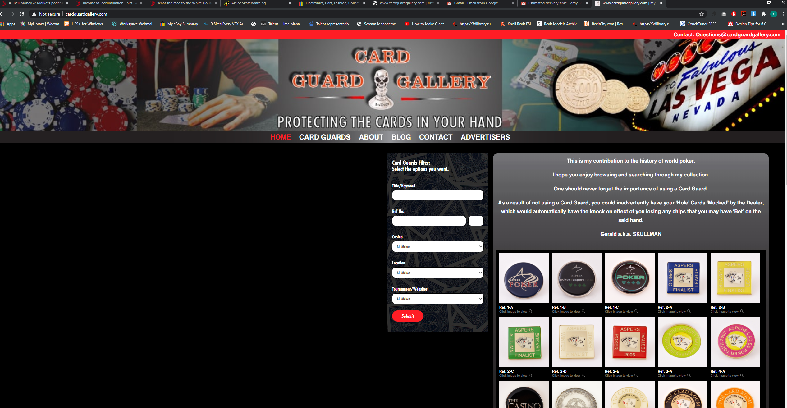
Throughout it was made clear that responsive design was of course very important. When logging into the site we decided having the filter as the prime interactive element a must.
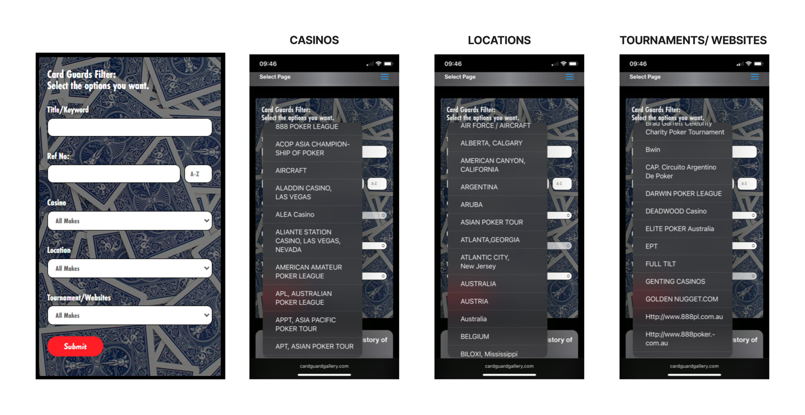
Filter Function:
The filter had to be able to find title/ keyword/ reference numbers, casino, location and tournament and websites. When the results are displayed they are in sequential order. Throughout the project there were issues which cropped up with the way the filter worked vs what the client wanted and what is possible from the database extraction from MySQL but by the end of the project we got it to work seamlessly with some rather creative PHP coding.
Card Guard View Page Cross Platform:
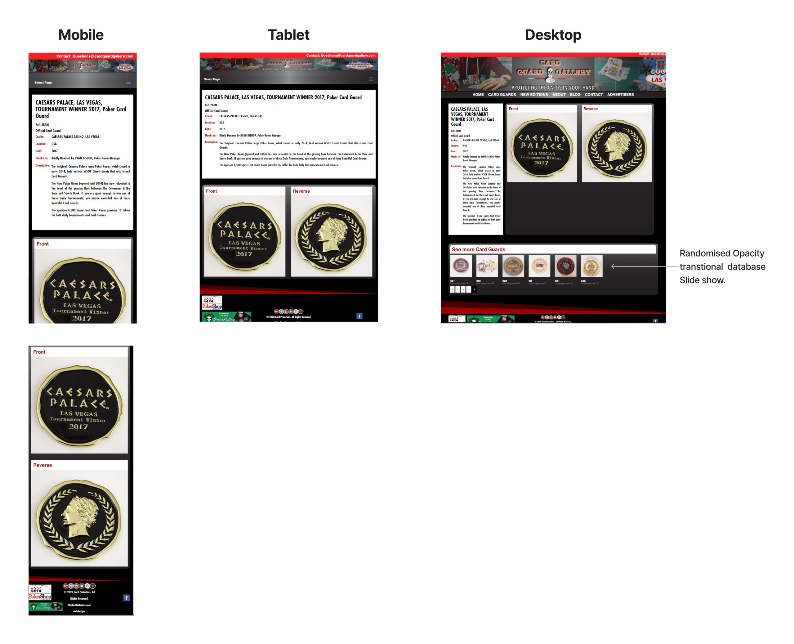
Note slide show only on desktop
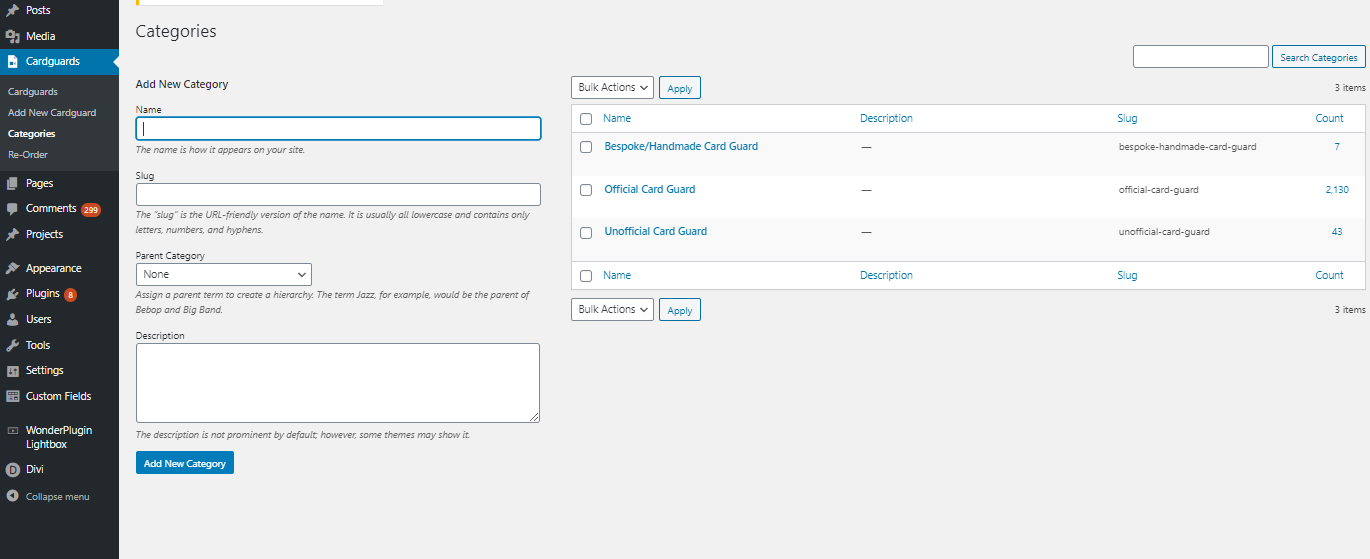
Customised WordPress add to Filter Backend:
Card Guard add category:
Card Guard editable database:
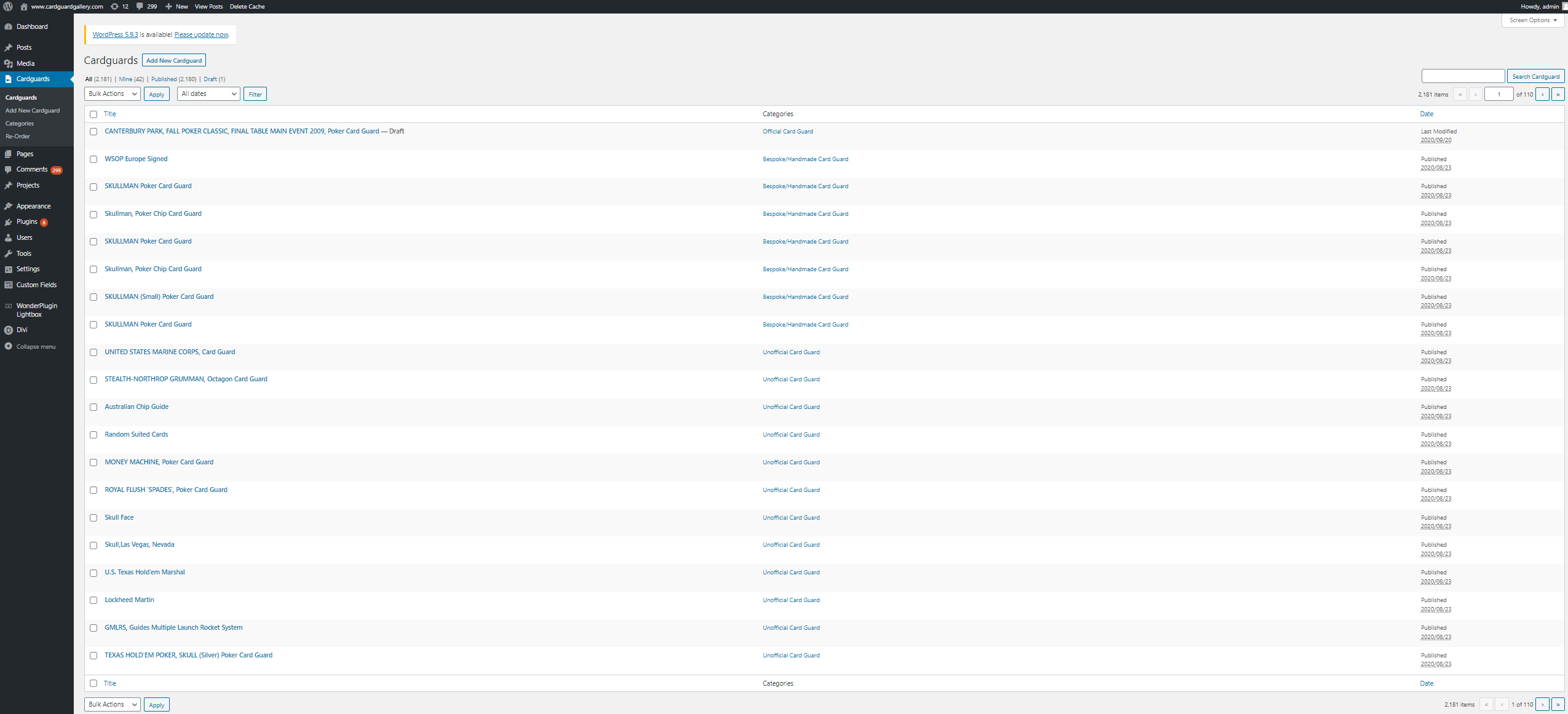
I had been instructed that the client ideally would like to edit and handle the database himself. WordPress facilitated this need in the simplest way. This was all custom made with the team in Delhi India. This required alot of cross referencing and testing.
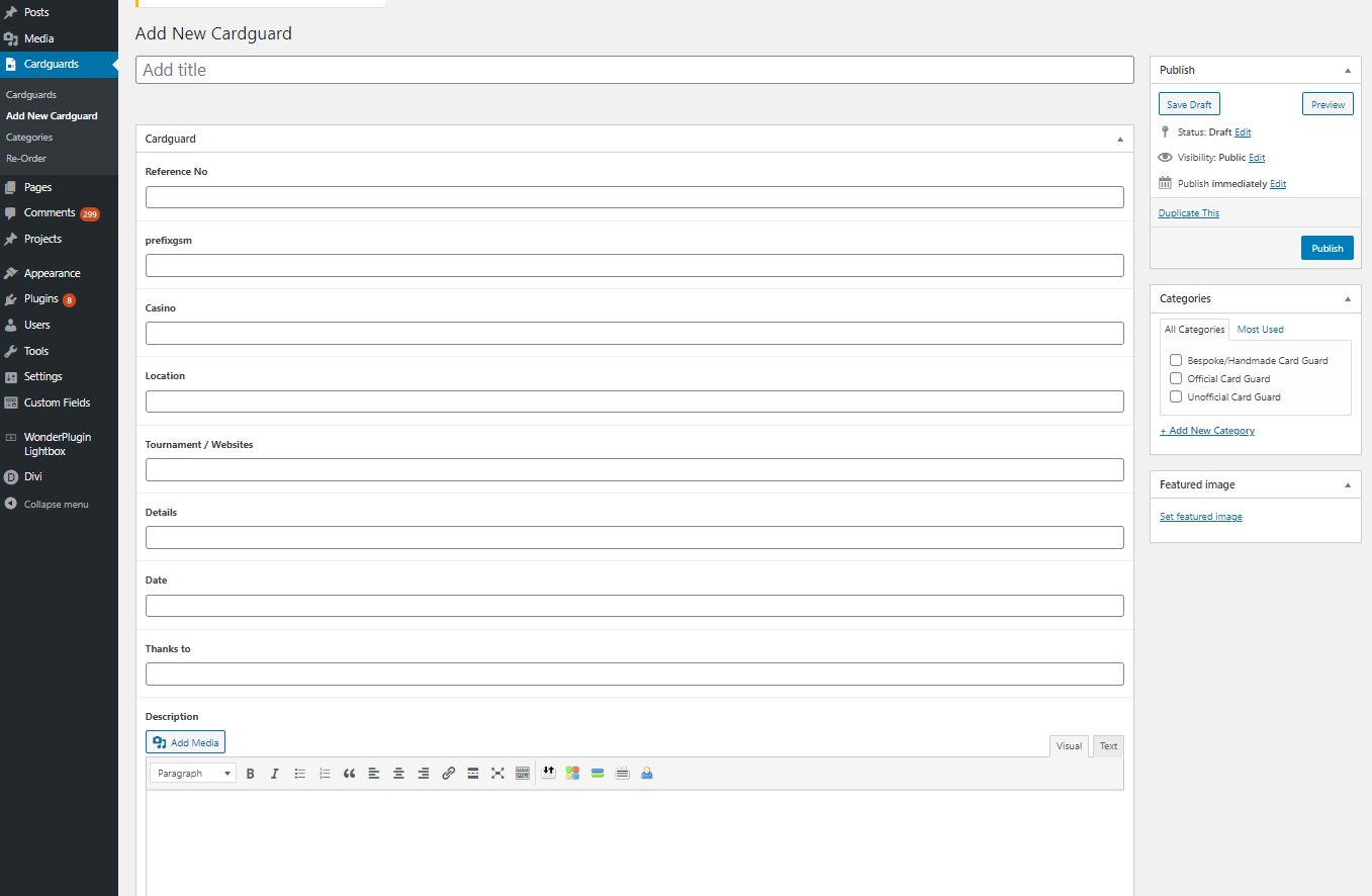
Where to add Card Guard:
Video Tutorial:
The client wanted walk throughs for reference to edit text, add new editions and add new Card Guards to database.

Takeaways:
This project was very niche from the start. The site is definitely aimed at the clients internal circles though we did still optimise SEO for search optimisation. Overall the client was very content with the delivery though it was advised that in order to create more traffic to the site he would need to implement a social media campaign strategy. It also was advised that he could turn it into a trade store but had at the time said maybe in the future. This would not be a issue due to foresight of this possibility in the customised database. Handling a external team in India came with many pros and cons but overall it worked for the best. Testing was the back bone of this project and the sheer size of the collection made it complex to check everything. Since this project strictly focused on the die hard poker fan, the next step would be to build out the “Poker shop”.
