Mission
The primary goal was to create a bolt on to the Saas packadge Empower. Which is sold and distributed to some fo the largest businesses in the UK such as LSE, Barclays, Iceland, Post Office, Virgin, BBC etc.
We wanted to use pre-existing functions in empower to optimise and design the base core how the system functions. The bolt on itself was to give employees in these companies to internally create cases against managers and work colleagues ranging in topics such as harassments, unfair dismissal and various other internal grievous issues.
Process
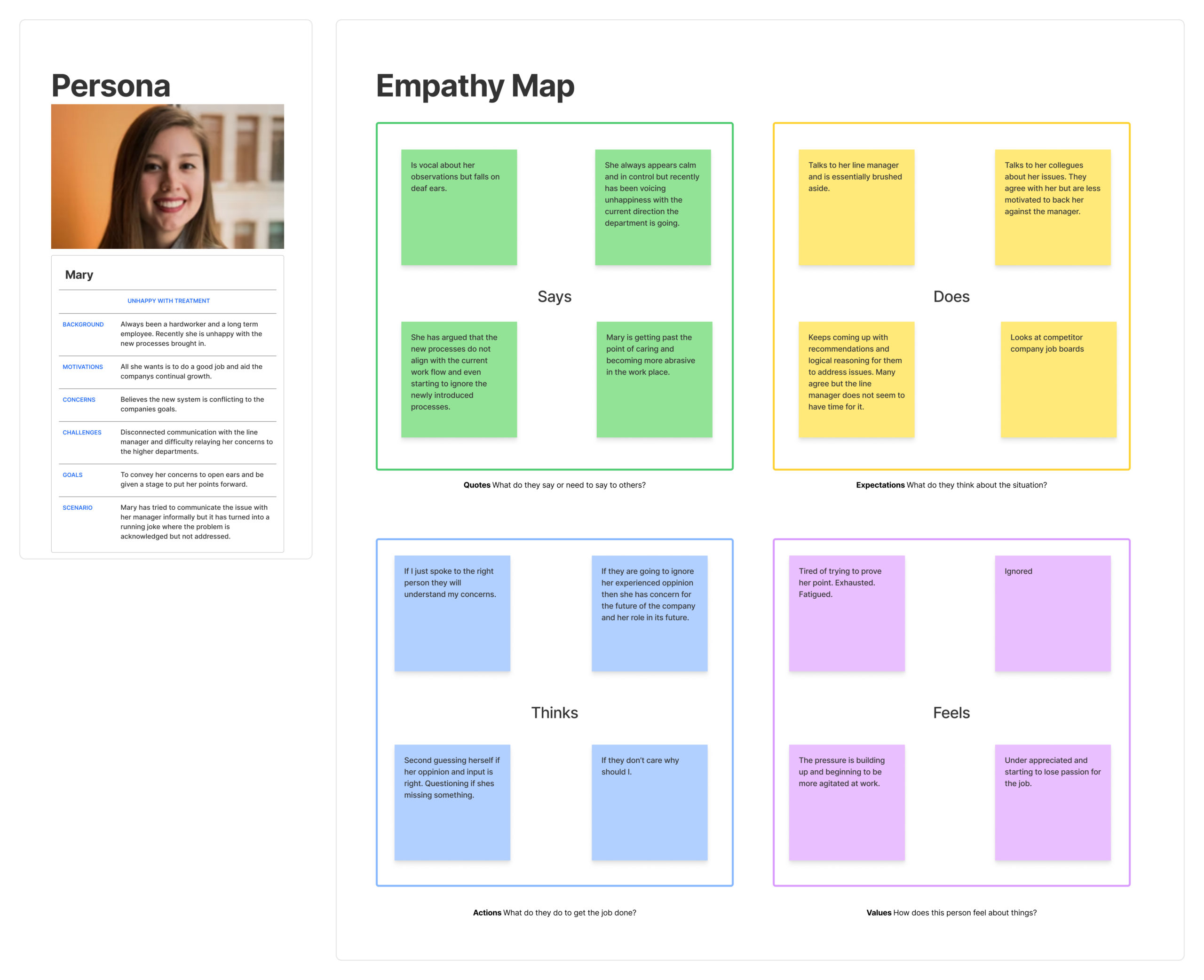
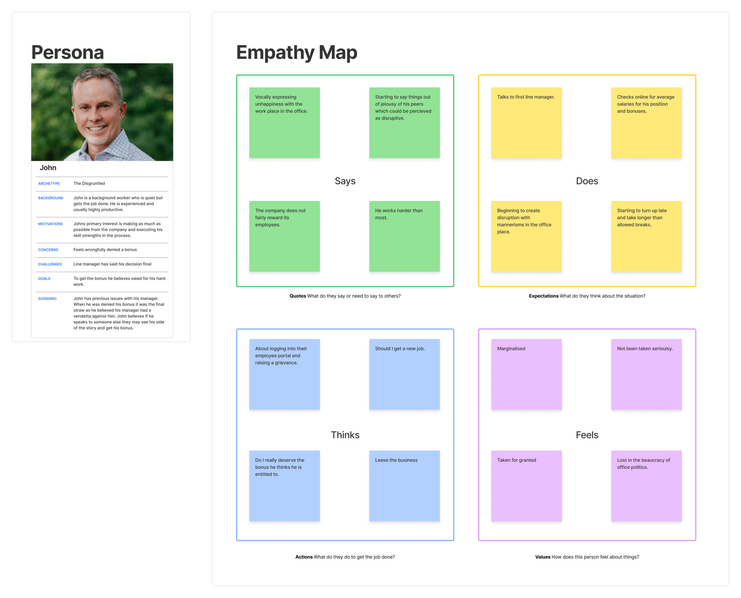
The first step in the process was to meet with the HR heads, Product developer, Adviser heads and Business Analysts. Together we established what had been asked of by our clients and how this new bolt on service would function in the preexisting system.
Using the knowledge from long serving company members and having a product developer who created the system from the start, we were put in a very good position to deliver on requests we said we would develop.
Between myself and the Business analysts we took what we learnt from everyone at the meetings and began to set and write the requirements.
Through this collaboration I was able to create mock ups and would hold weekly meetings. The point was for reflection of the processes in case some element had been missed. It became clear throughout this was an imperative element of the process due to the complexity of the mother system. We refined and tested before sending to the developers to develop.
Issues
The main issue was the limitations imposed by staying in the confines of the main system and aligning to the rather dated design standards which had not been reviewed for some time.
Some elements of the processes were relatively simple to adapt to the guided UX stories already in place, while in other situations forexample where the employee hands off the grievance to the correct line manager simply was not a existing process and needed considerable UI/UX consideration. Especially considering the sensitive nature of the content where it is imperative the correct people can or cannot see the raised concern.
Throughout we tried our best to highlight any prexisting concerns in the software to be picked up later down the line when it is reviewed as a whole and throughout I had to push back slightly to enhance the UI as best I could within our limitations.





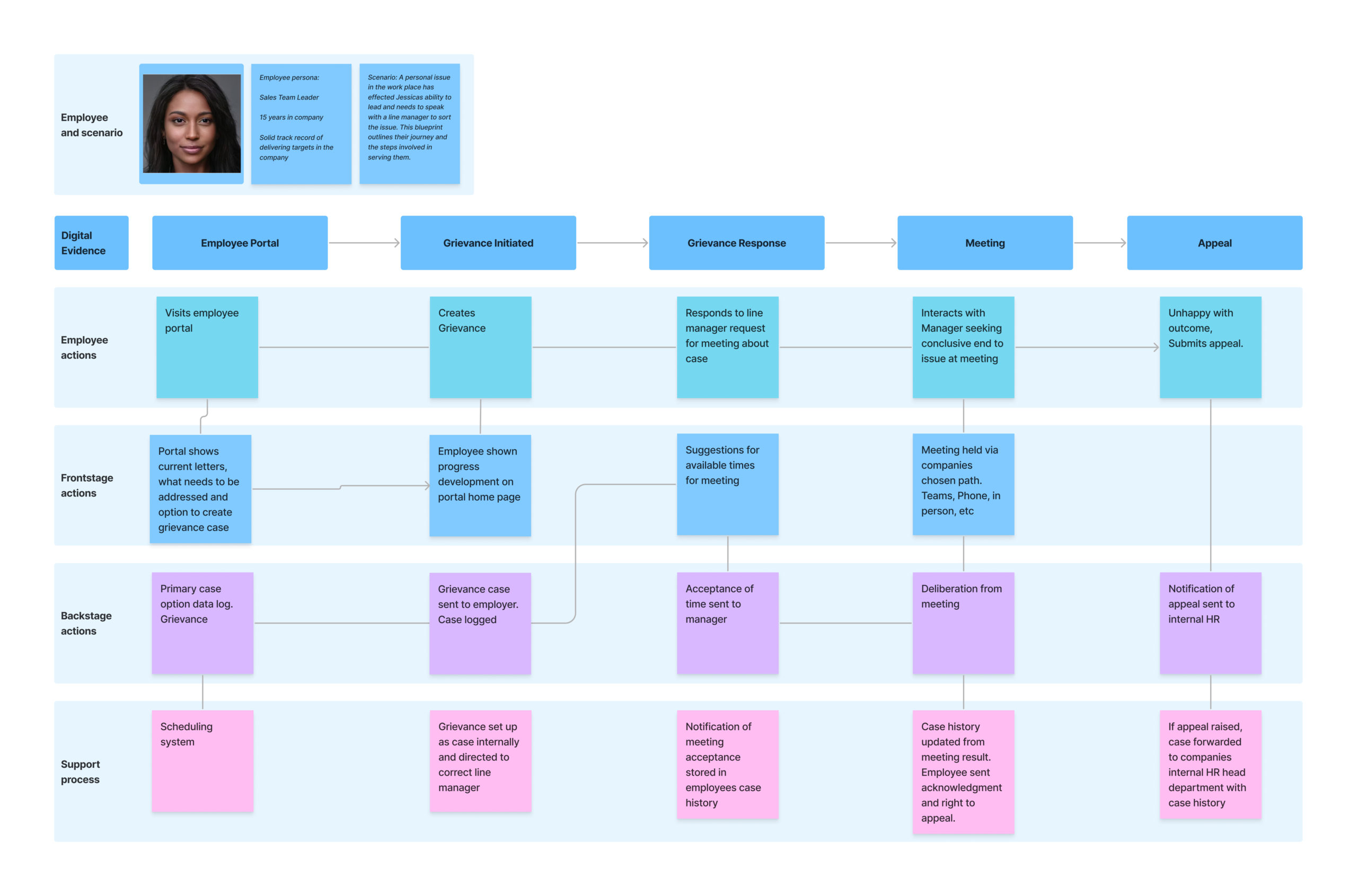
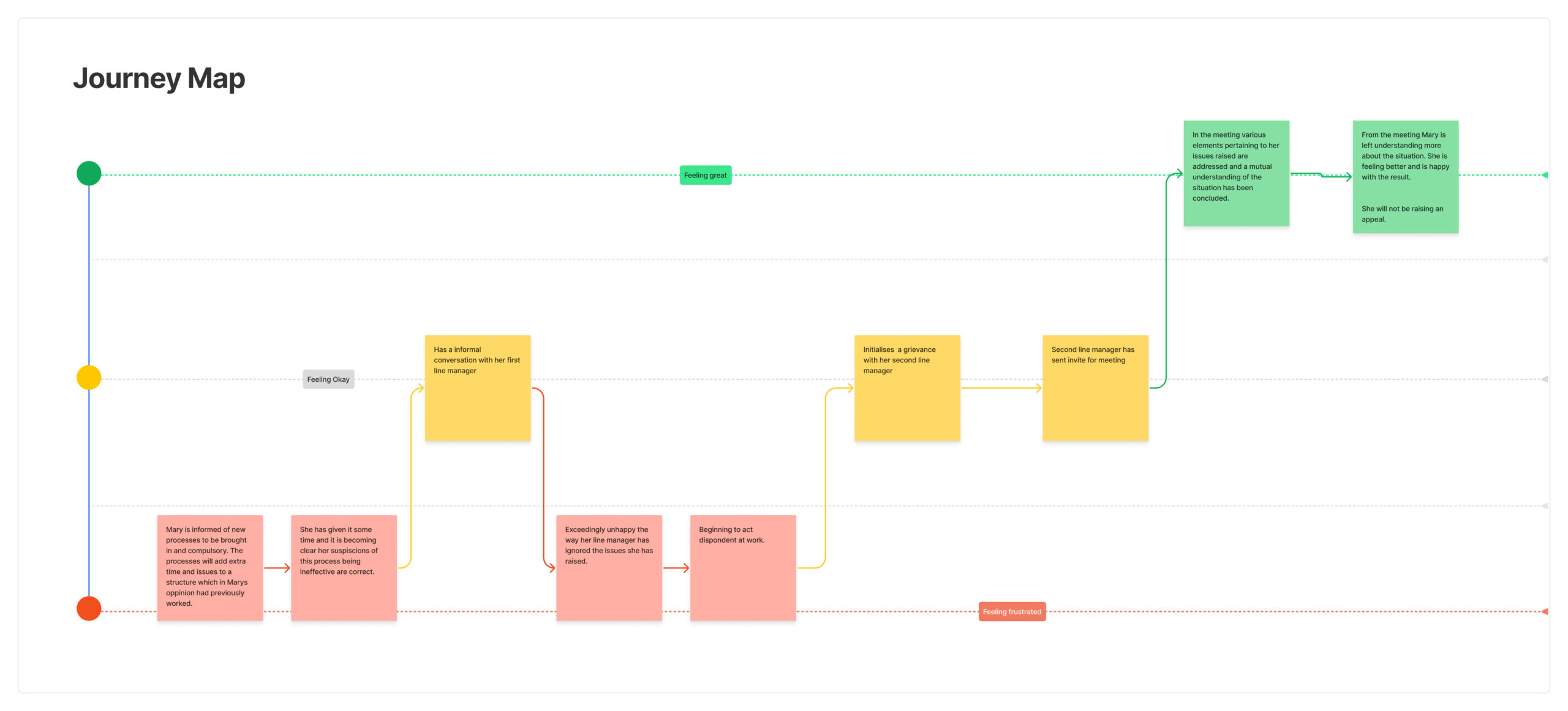
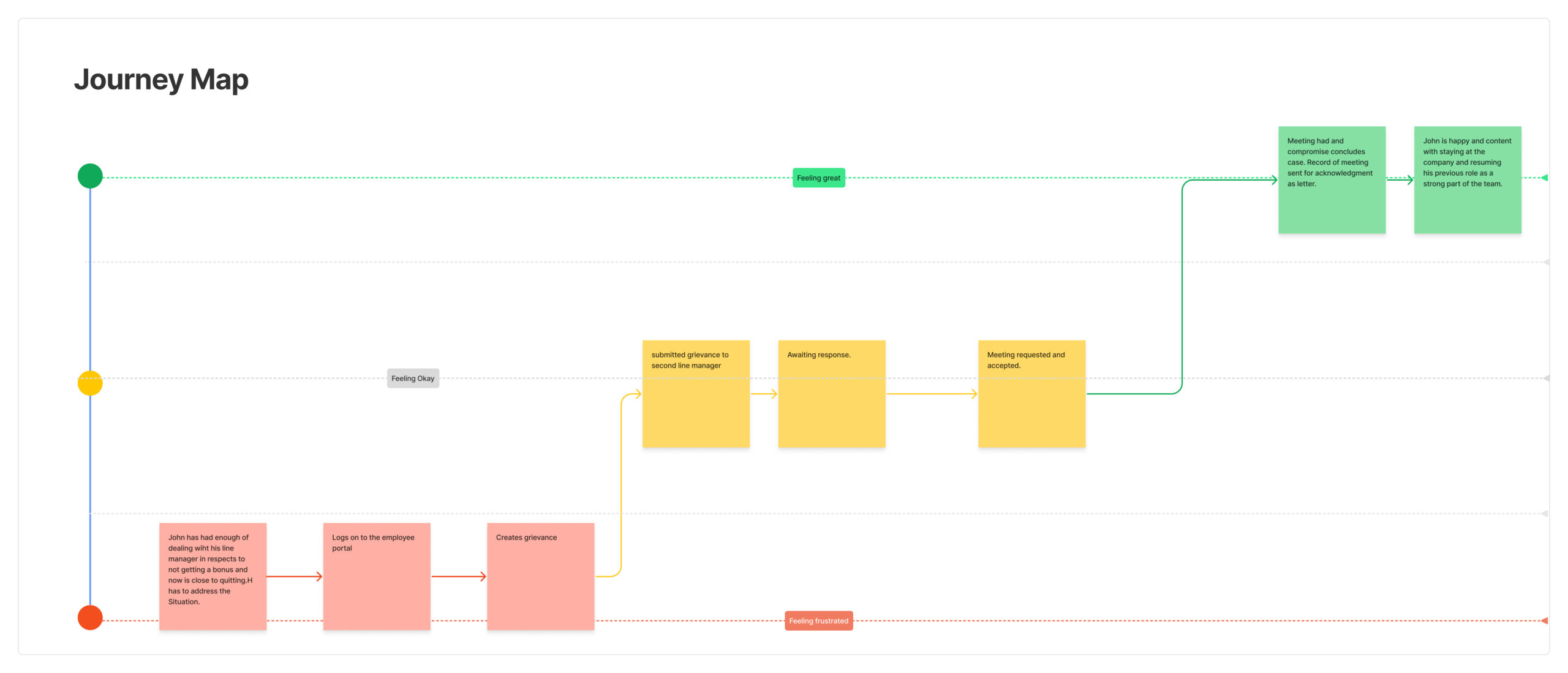
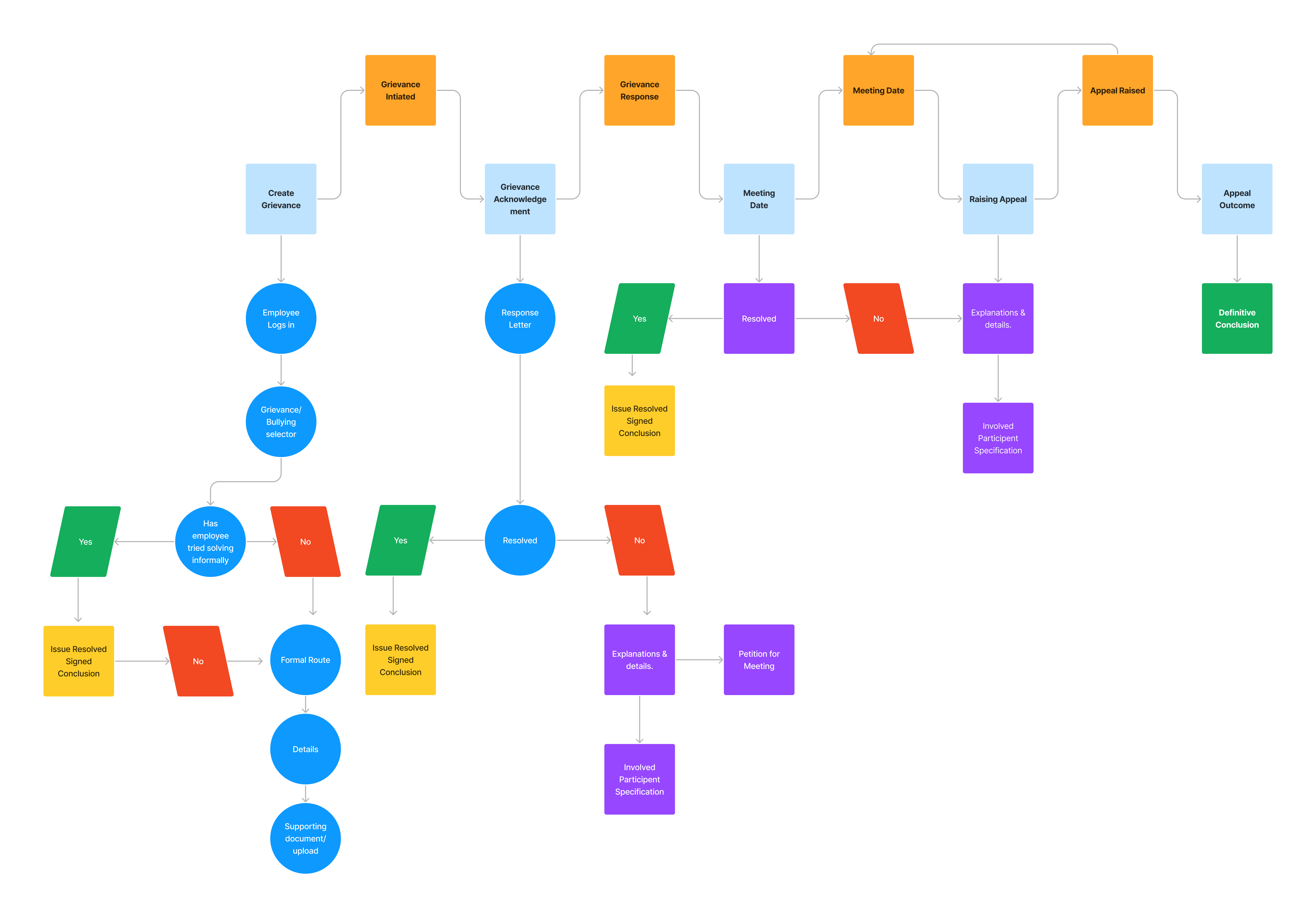
Wireframe:
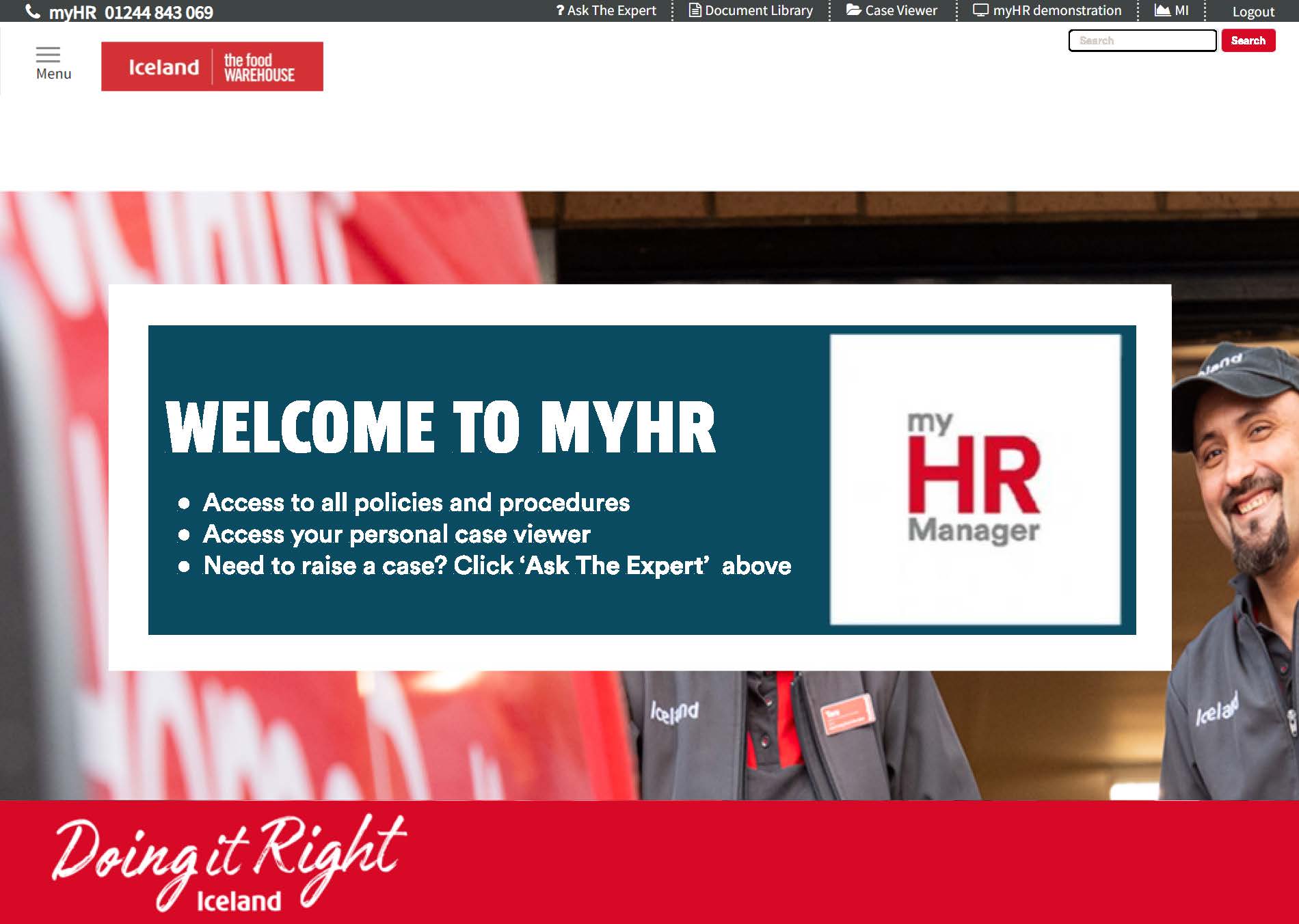
Examples of streamlined interface into portals for employee and and managers I designed under duress of companies indivdual branding conventions:
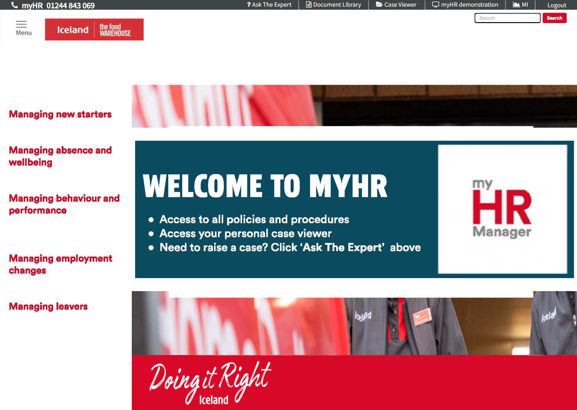
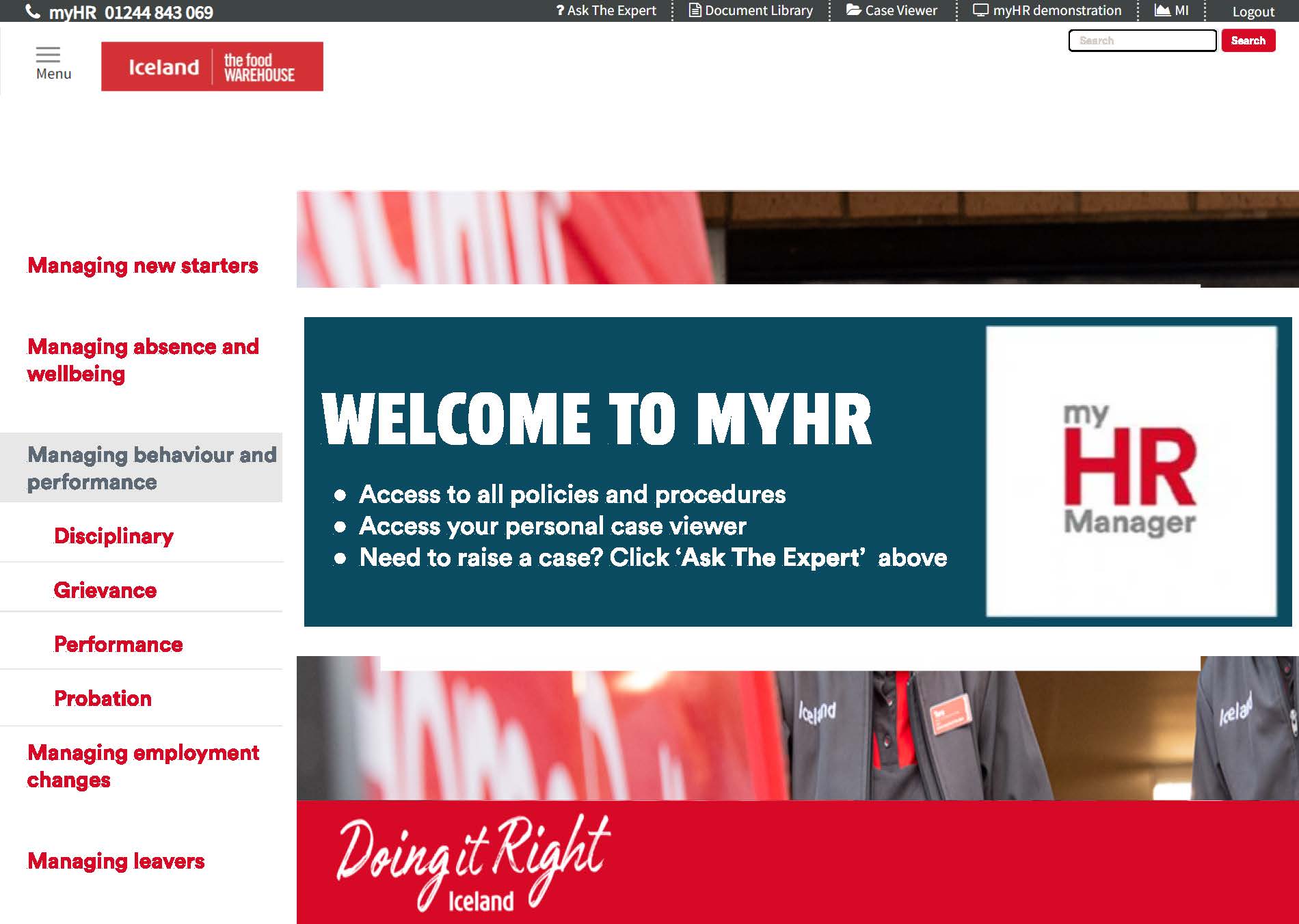
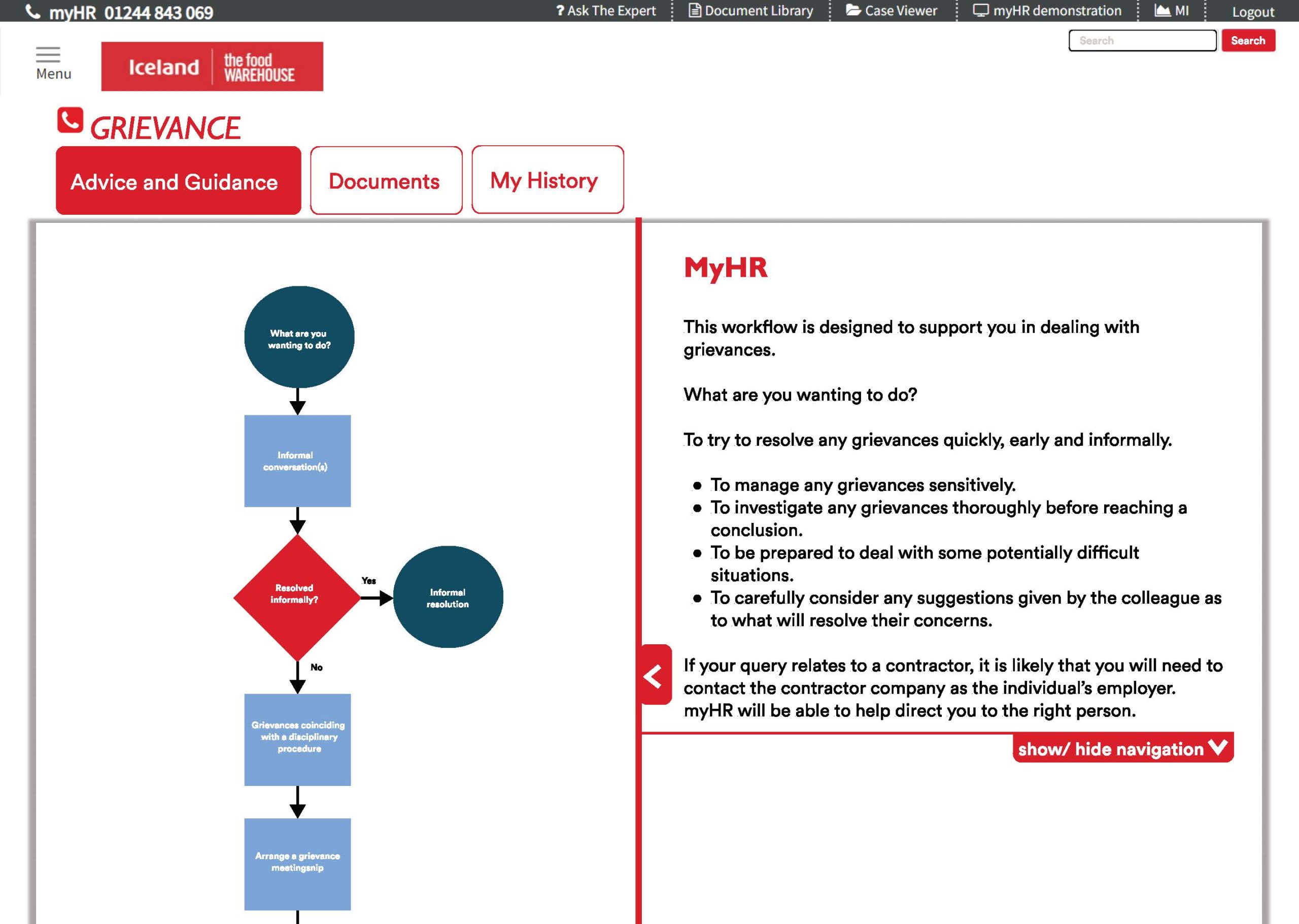
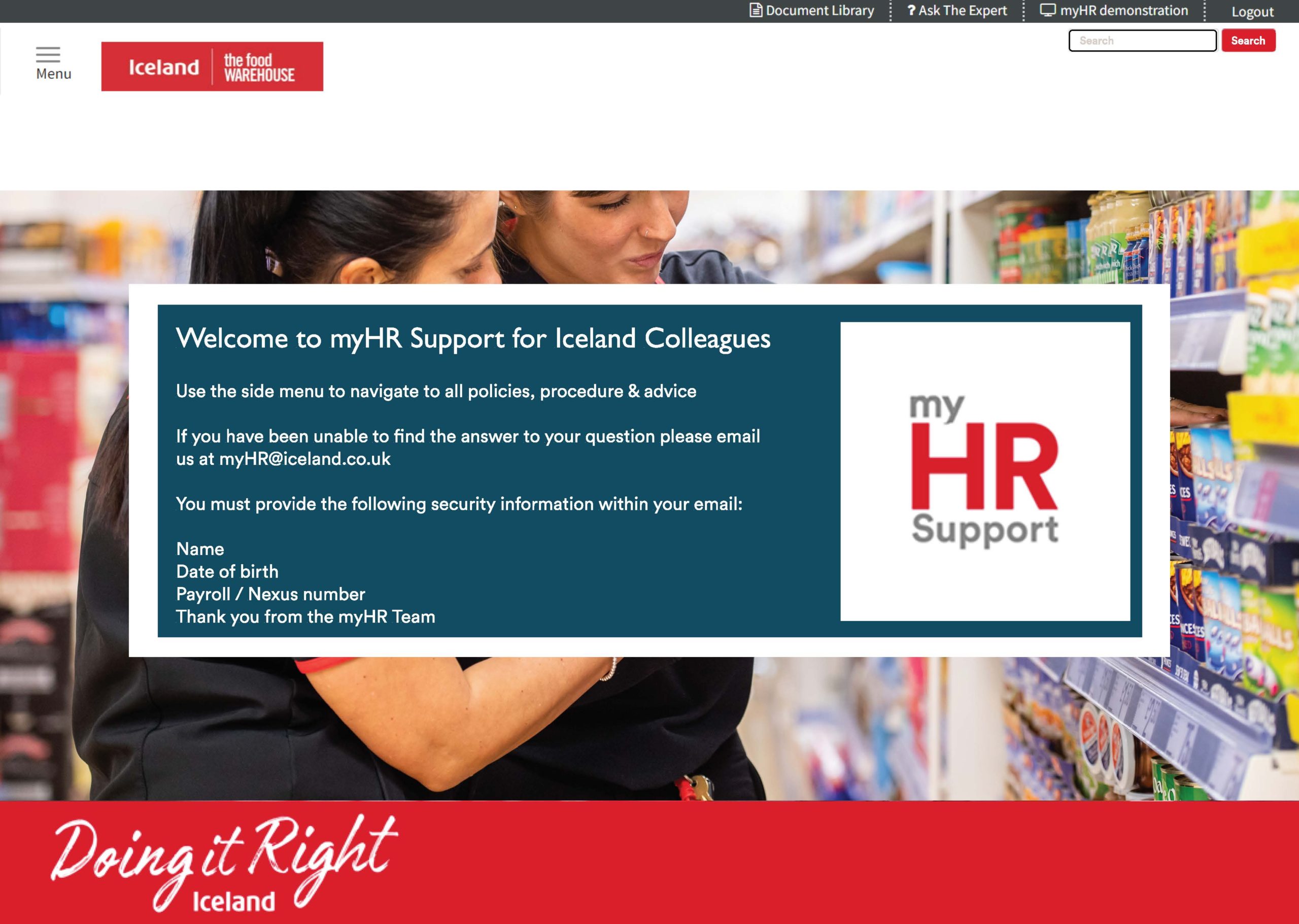

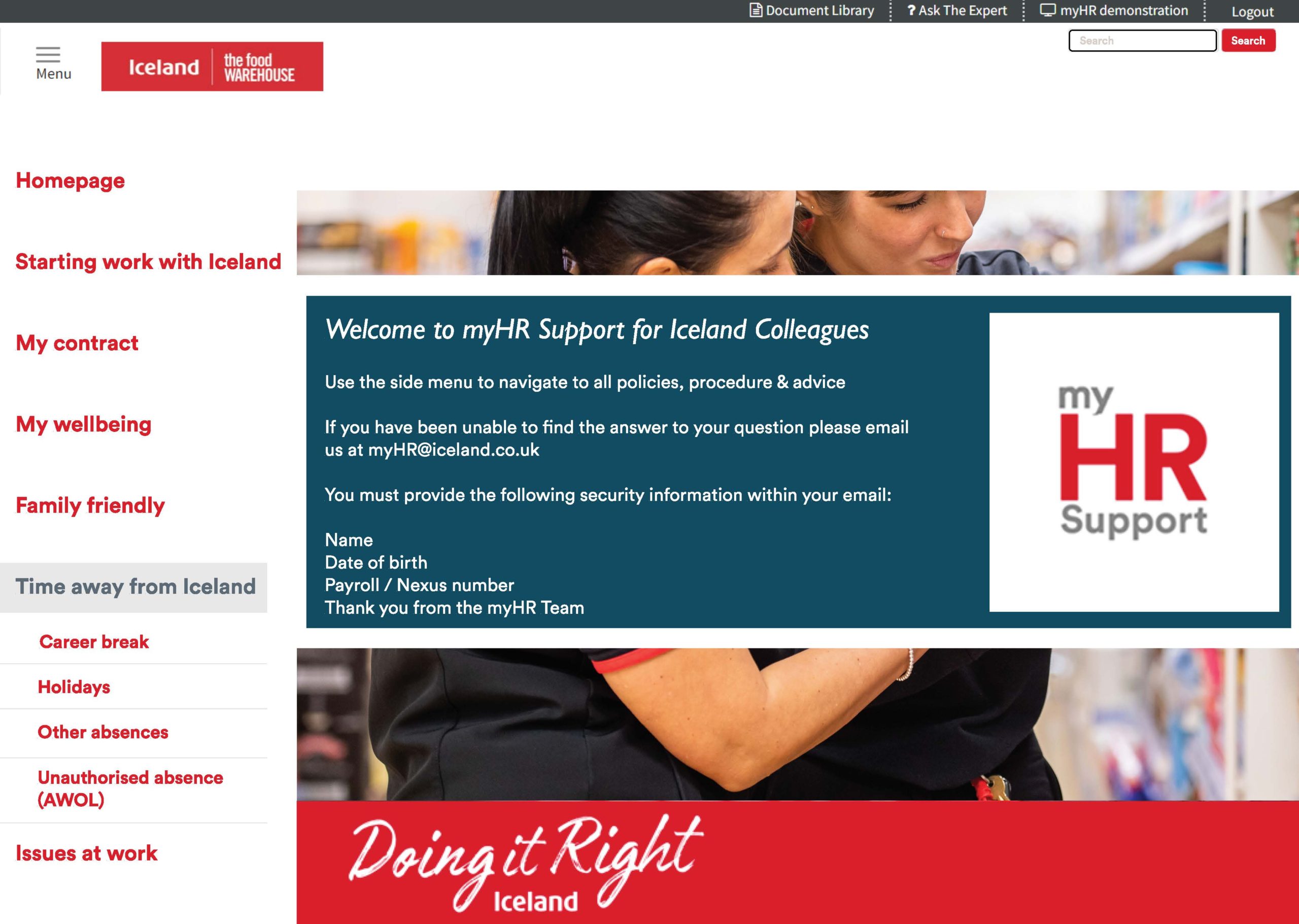
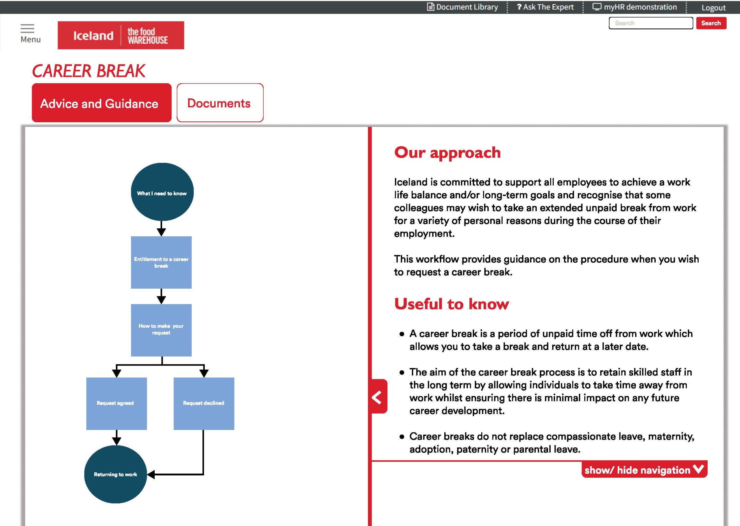
See below a quick walk through the low fidelity mock up I created using figma:
Reflection and Conclusion
The end product served its purpose within the limitations of the parameters of the preexisting system, which was created before I joined the team. This at times was quite frustrating but it is the nature of these internal softwares which are used by multiple large companies for a long period of time. It was great to work on a project which is integral to aiding line managers and employees run a tight ship. The aim was to give the autonomy to address and raise issues to one another in a smart, organised, functional way, which I believe given the confines succeeded in delivering.
The system is now in the developers hands and being pushed for release very soon to our clients.
©OddWalkStudios 2020, All Rights Reserved.
